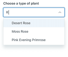
Autocomplete
Autocomplete is an input field that filters results as users type. This helps users find something quickly in a large list of options.
Used for this
- To filter down a large list of options
- To quickly find a known option
Not for this
- To make more than one selection, use Multiselect instead
How to use it
Default
The typical usage of an Autocomplete component.
Hidden label
Autocomplete labels can be hidden.
Media
Media elements add even more context to an Autocomplete.
Size
Autocomplete comes in two sizes: default and compact.
How to use it well
Use Autocomplete to narrow down options

Autocomplete is useful for lists that are too long to read in full (for example, company employees) or that accumulate items over time (for example, an inventory).
Configuration
- Name8.42.0•View source•View on npm
- Installnpm install @zendeskgarden/react-dropdowns
- Depsnpm install react react-dom styled-components @zendeskgarden/react-theming
- Importimport { Autocomplete, Dropdown, Field, Hint, Item, Label, Menu } from '@zendeskgarden/react-dropdowns'
API
Autocomplete
Extends HTMLAttributes<HTMLDivElement>
| Prop name | Type | Default | Description |
|---|---|---|---|
disabled | boolean | – | Indicates that the element is not interactive |
focusInset | boolean | – | Applies inset box-shadow styling on focus |
inputRef | Ref<HTMLInputElement> | – | Provides ref access to the underlying input element |
isBare | boolean | – | Removes borders and padding |
isCompact | boolean | – | Applies compact styling |
start | any | – | Defines the icon rendered in the start position |
validation | VALIDATION | – | Defines the element's validation state |
Dropdown
| Prop name | Type | Default | Description |
|---|---|---|---|
downshiftProps | object | – | Passes customization props to the Downshift component |
highlightedIndex | number | – | Highlights an element at a selected index |
inputValue | string | – | Sets the value of the input element |
isOpen | boolean | – | Opens the dropdown |
onInputValueChange | – | Handles input value change Parameters inputValue Value of the input elementstateAndHelpers Downshift state and helpers | |
onSelect | – | Handles item selection Parameters selectedItem The selected itemstateAndHelpers Downshift state and helpers | |
onStateChange | – | Handles state change Parameters options Downshift internal state changesstateAndHelpers Downshift state and helpers | |
selectedItem | any | – | Identifies the currently selected item |
selectedItems | any[] | – | Identifies the currently selected items |
Field
Extends HTMLAttributes<HTMLDivElement>
Hint
Extends HTMLAttributes<HTMLDivElement>
Item
Extends LiHTMLAttributes<HTMLLIElement>
| Prop name | Type | Default | Description |
|---|---|---|---|
disabled | boolean | – | Indicates that the element is not interactive |
value | any | – | Sets the value that is returned upon selection |
Label
Extends LabelHTMLAttributes<HTMLLabelElement>
| Prop name | Type | Default | Description |
|---|---|---|---|
isRegular | boolean | – | Applies regular (non-bold) font weight |
Menu
Extends HTMLAttributes<HTMLUListElement>
| Prop name | Type | Default | Description |
|---|---|---|---|
eventsEnabled | boolean | true | Allows the menu to reposition during browser resize events |
hasArrow | boolean | – | Attaches an arrow that points towards the menu trigger |
isAnimated | boolean | true | Animates the menu |
isCompact | boolean | – | Applies compact styling |
maxHeight | string | '400px' | Sets the max-height of the menu |
placement | GARDEN_PLACEMENT | bottom-start | Adjusts the placement of the menu |
popperModifiers | Modifiers | – | Passes configuration options to the Popper instance |
zIndex | number | 1000 | Sets the z-index of the menu |