Avatar
An Avatar is a visual way to represent a person or brand in the product. They can display text, icons, or images.
Used for this
- To visually represent a person, brand, or product
How to use it
Shape
An Avatar can be a circle or rounded square. See which shape to use.
Size
You have 5 sizes to choose from. The default size is medium.
Status
A colored ring outside the Avatar indicates a user’s status. The options are away, available, or active.
Type
An Avatar can contain an icon, an image, or text.
How to use it well
Select the right shape for the job
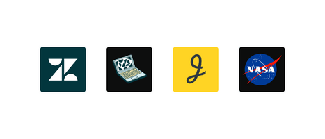
Use circles to represent people and rounded squares for objects, brands, or products. This helps a user distinguish between the two when scanning a page.

Use a circular Avatar for people.

Use a rounded square Avatar for objects, brands, or Zendesk products.
Configuration
- Name8.42.0•View source•View on npm
- Installnpm install @zendeskgarden/react-avatars
- Depsnpm install react react-dom styled-components @zendeskgarden/react-theming
- Importimport { Avatar } from '@zendeskgarden/react-avatars'
API
Avatar
Extends HTMLAttributes<HTMLElement>
| Prop name | Type | Default | Description |
|---|---|---|---|
backgroundColor | string | – | Sets the avatar background color |
badge | string | number | – | Sets the badge text and applies active styling |
foregroundColor | string | – | Sets the color for child SVG or Avatar.Text components |
isSystem | boolean | – | Applies system styling for representing objects, brands, or products |
size | 'small' | 'medium' | 'large' | 'extraextrasmall' | 'extrasmall' | 'medium' | Specifies the avatar size |
status | 'available' | 'away' | – | Applies status styling |
surfaceColor | string | – | Provides surface color for an avatar placed on a non-white background |
Avatar.Text
Extends HTMLAttributes<HTMLSpanElement>