Timeline
A Timeline lists events over a period of time.
- To track an issue over time
- To show events associated with an item
- To guide users through a step by step process, use a Stepper instead
How to use it
Default
The Timeline component is made up of individual Timeline items. Item content appears after the item marker by default.
Alternating
Items are displayed on alternating sides of the Timeline.
Custom media
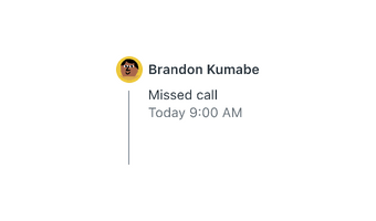
The item marker can also be replaced with another icon, image, or avatar.
Opposite content
In the opposite layout, a second content area is present on the opposite side of the Timeline.
How to use it well
Nest content when necessary
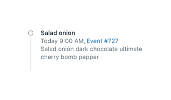
Components such as links, buttons, and images can be nested in each Timeline item.

Do include images and other nested content if appropriate.
Make interactive elements explicit
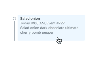
Creating a visual affordance for a link or action is preferred to making the entire item interactive.

Create explicit visual affordances for interactive items.

Don’t rely on hover states to show that items are interactive.
Use correct hierarchy
Item content can be replaced with any text style. Make sure to use appropriate hierarchy when designing your content.

Use balanced and appropriate typographic hierarchy.

Don’t mix up typographic hierarchy when customizing item content.
Configuration
- Name8.42.0•View source•View on npm
- Installnpm install @zendeskgarden/react-accordions
- Depsnpm install react react-dom styled-components @zendeskgarden/react-theming
- Importimport { Timeline } from '@zendeskgarden/react-accordions'
API
Timeline
Extends HTMLAttributes<HTMLOListElement>
| Prop name | Type | Default | Description |
|---|---|---|---|
isAlternate | boolean | – | Applies alternate styling |
Timeline.Content
Extends HTMLAttributes<HTMLDivElement>
Timeline.Item
Extends HTMLLIElement
| Prop name | Type | Default | Description |
|---|---|---|---|
icon | ReactNode | – | Replaces the dot with an icon |
surfaceColor | string | – | Provides surface color for an SVG icon placed on a non-white background |
Timeline.OppositeContent
Extends HTMLAttributes<HTMLDivElement>