Icon button
Icon buttons (like Buttons) let users take action. They are used for repeated or persistent actions on a page and lack visible labels to simplify the UI.
- To simplify the appearance of repeated or persistent actions on a page
- To enable action in a toolbar
- To enable primary and secondary actions on a page, use a Button instead
How to use it
Default
The typical usage of an Icon button component.
Danger
Use danger styling for Icon buttons that enable destructive action.
Disabled
A disabled Icon button prevents user interaction. It doesn’t appear in the tab order, can’t receive focus, and may not be read aloud by a screenreader.
Shape
Icon buttons are circular by default, but they can be squares too.
Size
Icon buttons can be small, medium, or large. The default size is medium.
Type
Icon buttons have 3 types: basic, outline, and primary. The default type is basic.
How to use it well
Don’t leave users in the dark

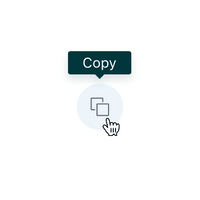
Include a Tooltip to help any users who may be unfamiliar with the icon.
Configuration
- Name8.42.0•View source•View on npm
- Installnpm install @zendeskgarden/react-buttons
- Depsnpm install react react-dom styled-components @zendeskgarden/react-theming
- Importimport { IconButton } from '@zendeskgarden/react-buttons'
API
IconButton
Extends ButtonHTMLAttributes<HTMLButtonElement>
| Prop name | Type | Default | Description |
|---|---|---|---|
focusInset | boolean | – | Applies inset box-shadow styling on focus |
isBasic | boolean | true | Applies basic button styling |
isDanger | boolean | – | Applies danger button styling |
isNeutral | boolean | – | Applies neutral button styling |
isPill | boolean | true | Applies pill button styling |
isPrimary | boolean | – | Applies primary button styling |
isRotated | boolean | – | Rotates icon 180 degrees |
size | 'small' | 'medium' | 'large' | 'medium' | Specifies icon button size |